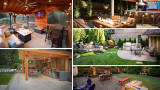
How to Use Color Theory in Your Landscaping for Maximum Impact
Color is one of the most powerful tools in landscape design—and one of the most misunderstood. While many homeowners think of color as flowers and seasonal blooms, true landscape color theory goes much deeper. When used intentionally, color shapes how outdoor spaces feel, guides the eye through the landscape, and enhances the emotional experience of being outdoors.
For Atlanta homeowners investing in luxury outdoor living, color is not about adding more—it’s about choosing wisely. Understanding how to apply color theory in landscaping allows outdoor spaces to feel cohesive, expressive, and refined in every season.
What Is Landscape Color Theory?
Landscape color theory refers to how colors interact with one another and influence perception, emotion, and spatial experience in outdoor environments. Unlike interior spaces, landscapes are dynamic—light changes, plants evolve, and seasons shift.
Effective landscape color design considers:
- How colors work together across the property
- How color affects mood and movement
- How seasonal changes impact visual balance
In luxury landscapes, color is used deliberately—not decoratively.
The Emotional Impact of Color in Outdoor Spaces
Colors trigger emotional responses, often subconsciously. This makes color one of the most influential aspects of mood and color landscaping.
- Cool colors like greens, blues, and soft purples promote calm and relaxation
- Warm colors like reds, oranges, and yellows add energy and vibrancy
- Neutral tones create balance and visual breathing room
Successful outdoor spaces balance these tones to support how the space is meant to be used.
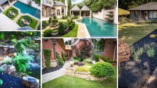
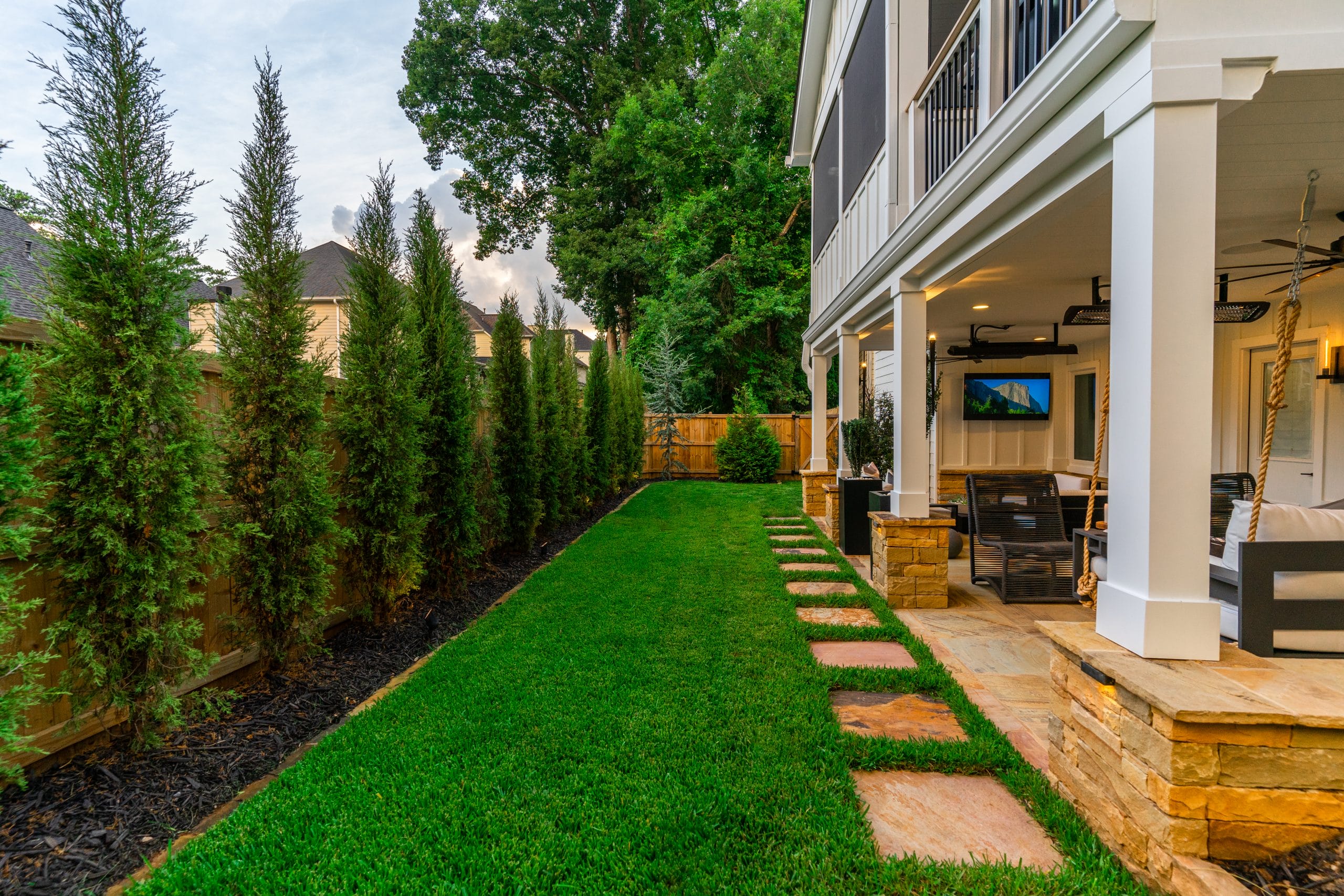
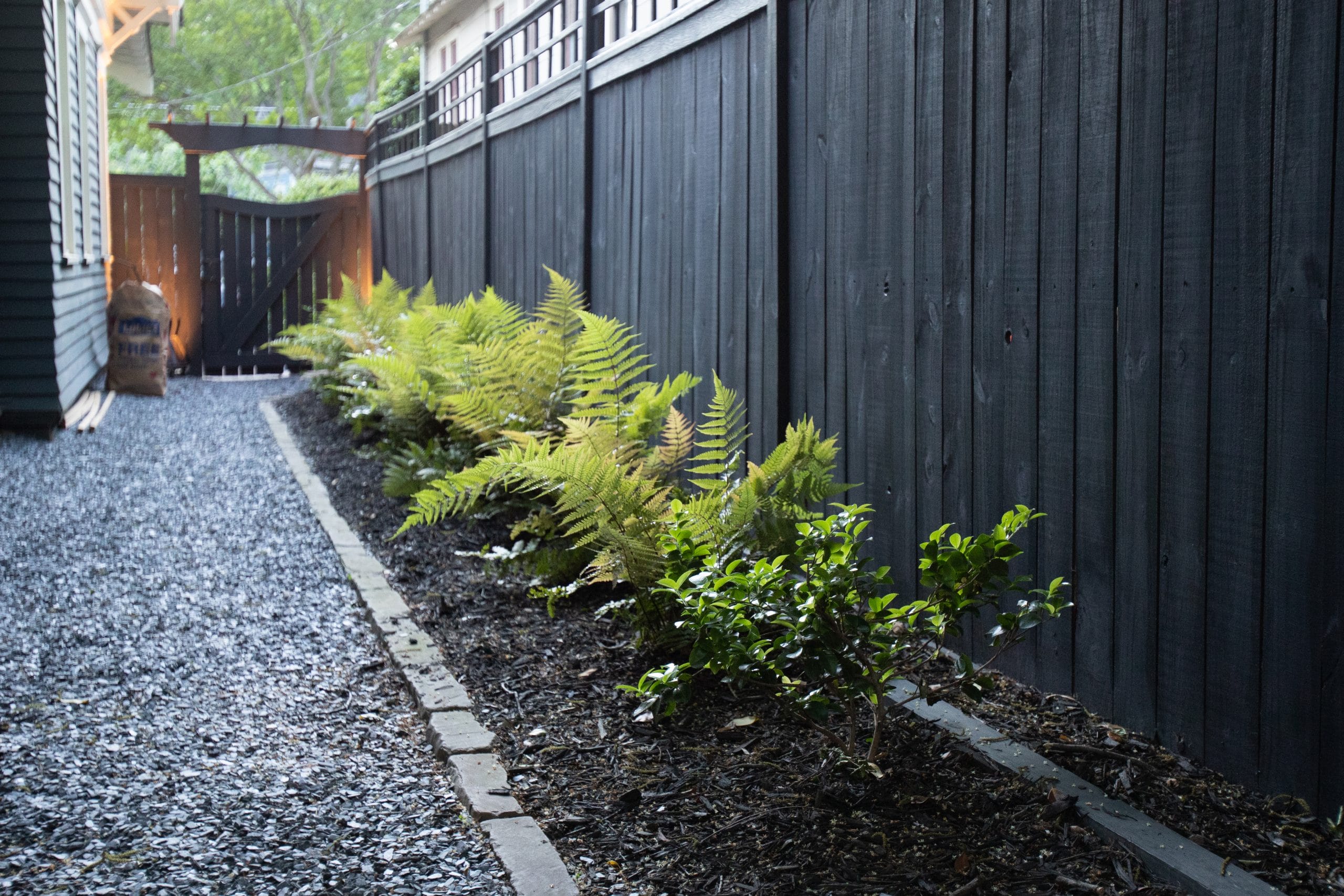
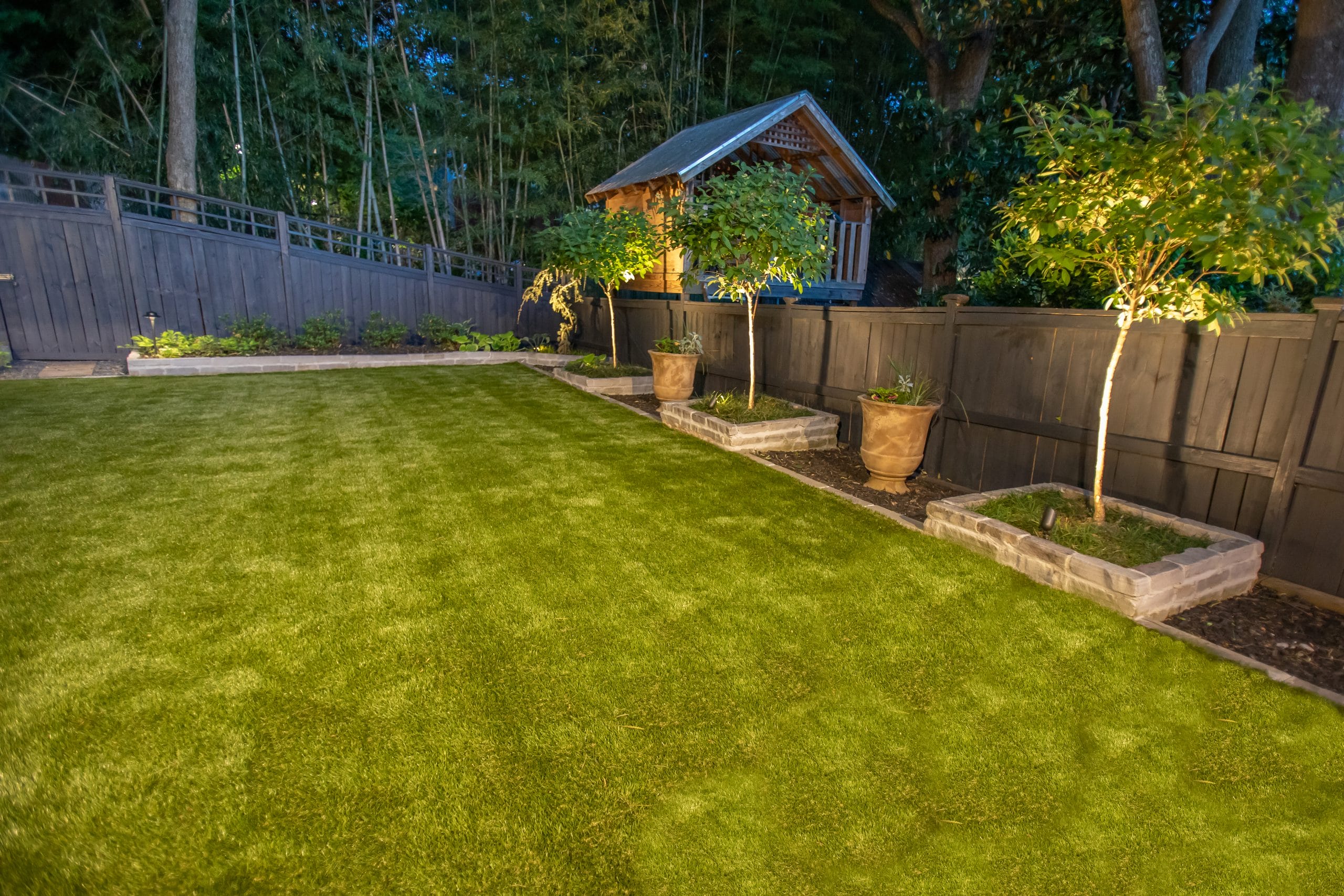
Using Green as the Foundation
In landscaping, green is the dominant color—and for good reason. It provides visual rest, continuity, and cohesion across the landscape.
Design strategies using green include:
- Varying shades and textures rather than relying on blooms
- Using evergreen plants to anchor the color palette year-round
- Allowing green to frame and soften architectural elements
When green is treated as a foundation rather than a filler, other colors become more impactful.
Creating Garden Color Palettes That Feel Intentional
A garden color palette is a curated selection of colors that work together harmoniously. In luxury landscapes, palettes are restrained and purposeful.
Effective garden color palettes:
- Use repetition to create rhythm
- Limit contrast to avoid visual chaos
- Allow one dominant tone with supporting accents
Rather than mixing everything available, refined landscapes choose fewer colors and use them consistently.
Seasonal Plant Color Design Without Visual Disruption
Seasonal color adds interest—but it should never feel disruptive. Seasonal plant color design works best when it supports the overall palette rather than replacing it.
Design strategies include:
- Using seasonal color in predictable locations
- Limiting bold seasonal hues to accent areas
- Ensuring the landscape remains cohesive when blooms fade
This approach preserves visual stability across seasons.
Warm vs. Cool Color Placement in Atlanta Landscapes
In Atlanta backyard design, climate and light influence how color is perceived. Warm sunlight can intensify hues, making placement especially important.
Placement considerations include:
- Using cooler colors in relaxation zones
- Reserving warm colors for focal points or gathering areas
- Avoiding excessive warm tones in already sunny locations
Thoughtful placement ensures colors enhance comfort rather than overwhelm the senses.
Color as a Tool for Visual Movement
Color can guide how the eye moves through an outdoor space. Strategic color placement helps define pathways, focal points, and transitions.
Design techniques include:
- Repeating color along walkways to encourage flow
- Using brighter hues to draw attention to key features
- Softening distant areas with muted tones
This creates visual order and intentional movement.
Mood & Color Landscaping for Different Outdoor Zones
Different outdoor spaces benefit from different emotional cues. Color helps establish these distinctions without physical barriers.
Examples include:
- Calming palettes in lounge and retreat areas
- Balanced neutrals in dining spaces
- Controlled pops of color in social zones
This zoning enhances function while maintaining overall cohesion.
Using Color to Influence Perceived Space
Color can subtly change how large or small a space feels. This is especially useful in properties with varied scales.
- Lighter colors can make smaller spaces feel more open
- Darker tones add depth and intimacy
- Gradual color transitions create a sense of expansion
These techniques enhance spatial balance without structural changes.
Color & Hardscape Integration
Landscape color theory extends beyond plants. Hardscape materials play a major role in the overall palette.
Design considerations include:
- Matching stone tones with plant hues
- Using neutral hardscapes to ground colorful plantings
- Ensuring hardscape color remains timeless
This integration prevents the landscape from feeling fragmented.
Avoiding Common Color Mistakes in Landscaping
Even well-intentioned color choices can work against the design if not handled carefully.
Common mistakes include:
- Too many competing colors
- Relying heavily on seasonal blooms
- Ignoring how color changes throughout the day
Luxury landscapes avoid these pitfalls through restraint and planning.
Designing for Year-Round Color Balance
The most successful landscapes feel balanced even when plants aren’t blooming. This is achieved through structure, texture, and evergreen presence.
Year-round color balance relies on:
- Evergreen foliage as a constant backdrop
- Subtle variation in leaf color and texture
- Minimal dependence on peak-season flowers
This ensures visual interest without seasonal reliance.
Why Professional Guidance Elevates Color Design
Applying color theory in landscaping requires more than aesthetic preference—it requires understanding how color behaves outdoors.
Outdoor Makeover’s large-scale project capability allows us to create cohesive color strategies across entire properties. Our one-year support guarantee and extensive aftercare services ensure these palettes remain intentional as landscapes mature.
Using Color to Tell a Visual Story
Color is a storytelling tool. When used with intention, it reinforces how an outdoor space is meant to be experienced—calm, vibrant, welcoming, or contemplative.
At Outdoor Makeover, we design landscapes where color supports lifestyle, emotion, and long-term beauty. Through thoughtful color theory and refined craftsmanship, we help Atlanta homeowners create outdoor environments with lasting visual impact and emotional resonance.